We're at that time on the calendar where in prior years we've seen weakness show up in the U.S. equity markets. And so the reasoning goes that because everyone is looking for it, the pattern of a slowing economy and it translating to lower stock prices will be negated.
Tops take time to form as large institutions distribute stock while the market is still rising, then continue to unload shares as the market pauses and trades sideways for awhile.
The last chunk of shares that gets sold before the decline takes hold sometimes shows up on the charts as churn days. This happens when we see higher volume trading with the indices showing little to no price progress.
The last 2 days have shown signs of churning in the S&P 500 when the market weakened in the last 2 hours of trading on both days.
Despite the fact that the S&P 500 sits just 1% off all-time highs, some signs of weakness are showing up in the charts. In my opinion, this is an opportunity for a very low risk short entry on the broad U.S. indices, with a stop loss just above recent highs.
At the minimum, after such a strong advance off the November lows, this is not a time to be complacent.
Here are a few annotated charts on different time frames that show what could be a head and shoulders topping pattern potentially forming.
This first chart was posted to Twitter and StockTwits back on Wednesday.
Click on charts to enlarge:

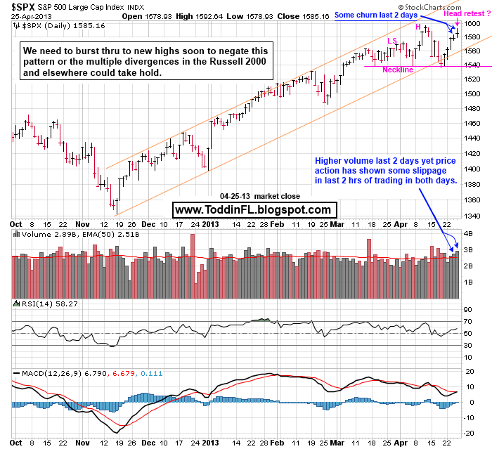
Here's an update of that previous chart:


Tops take time to form as large institutions distribute stock while the market is still rising, then continue to unload shares as the market pauses and trades sideways for awhile.
The last chunk of shares that gets sold before the decline takes hold sometimes shows up on the charts as churn days. This happens when we see higher volume trading with the indices showing little to no price progress.
The last 2 days have shown signs of churning in the S&P 500 when the market weakened in the last 2 hours of trading on both days.
Despite the fact that the S&P 500 sits just 1% off all-time highs, some signs of weakness are showing up in the charts. In my opinion, this is an opportunity for a very low risk short entry on the broad U.S. indices, with a stop loss just above recent highs.
At the minimum, after such a strong advance off the November lows, this is not a time to be complacent.
Here are a few annotated charts on different time frames that show what could be a head and shoulders topping pattern potentially forming.
This first chart was posted to Twitter and StockTwits back on Wednesday.
Click on charts to enlarge:

Here's an update of that previous chart: